
The Brand Dossier Series • Vol. I
CAM — California Artisanal Medicine
Woman-Owned
A Chronicler-grade cultural and anthropological dossier examining CAM’s matriarchal craft ethos, Humboldt lineage, and luxury-clean design language—an artifact for brand owners, operators, and decision-makers serious about cultural capital.
Ethos: Craft • Purity • Stewardship
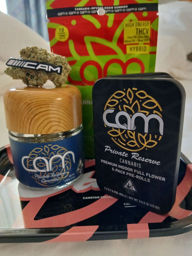
Aesthetic: Navy / Gold / Woodgrain
Territory: California • Humboldt to Statewide
“CAM doesn’t use sex to sell. They use mastery. Powerful women set the standard, the brand follows—clean, disciplined, and deeply Californian.”— Budtender Jack, Field Notes (Hall of Flowers, Ventura & Santa Rosa)
Chronicler Key Findings
- CAM codes “matriarchal authority” into brand behavior: quality as moral leadership, not marketing veneer.
- Design semiotics (navy, gold, wood) signal connoisseurship, calm, and surgical cleanliness—inviting trust at point of purchase.
- Market posture: premium but principled; avoids cheap dopamine, favors provenance and repeatable excellence.
- Community effect: raises standards for budtenders; elevates women’s leadership as normative in cannabis craft.
Positioning Summary
CAM functions as a cultural north star for California purity—bridging Humboldt’s terroir ethic with modern luxury restraint. The result is trust you can sense before you read the label.
1) Anthropological Analysis — Stewardship & the Matriarchal Frame
CAM’s center of gravity is stewardship: the disciplined, caretaker mindset historically associated with women’s leadership in craft traditions. Rather than spectacle, CAM privileges calibration—inputs controlled, outcomes consistent. In retail anthropology terms, the brand performs “quiet power”: staff mirror it, customers feel it, communities benefit from it. This is how a brand turns ethics into competitive advantage.
2) Linguistics & Symbolism — Why Navy/Gold Works
Navy communicates credibility and calm; gold signals earned prestige; woodgrain nods to the artisan’s bench. Together they narrate “measured excellence.” Typography is restrained—assertive without being loud—matching a woman-owned brand that commands respect by merit, not provocation.
3) Market Semiotics — Trust as a Luxury Good
In a market fatigued by novelty, CAM sells the opposite: repeatability. The promise is not “new,” it’s “reliably excellent.” This is why budtenders recommend CAM with confidence—brand equity becomes a time-saver at the counter and a risk reducer for the shopper.
4) Field Notes — Events, Trainings, Social Texture
Chronicler has engaged CAM across events and trainings (including Hall of Flowers, Ventura/Santa Rosa). The interpersonal texture matches the packaging: clear standards, mutual respect, no gimmicks.
“On the floor, CAM’s team treats excellence like a duty. It’s contagious—budtenders start operating like curators.”
5) Cultural Forecast — Where CAM Goes Next
Expect deeper codification of provenance (batch-level storytelling), continued woman-led mentorship optics, and expanded “clean craft” education for retail teams. CAM is well-positioned to anchor dispensary curation programs that reward consistency over hype cycles.
Provenance Markers (Concise)
- Lineage: Humboldt ethos → statewide refinement.
- Design: Navy/Gold + wood; restrained typography; clinic-clean hierarchy.
- Retail Effect: High trust; staff advocacy; repeat-purchase behavior.
- Community: Normalizes women’s executive leadership in cannabis craft.
Work with Chronicler: Turn your brand’s truth into cultural capital and revenue.
Chronicler Cannabis • The Brand Dossier Series
Vol. I — CAM
Vol. II — Don Perico (Next)
Dispensary Vol. I — Haven (Next)


You must be logged in to post a comment.